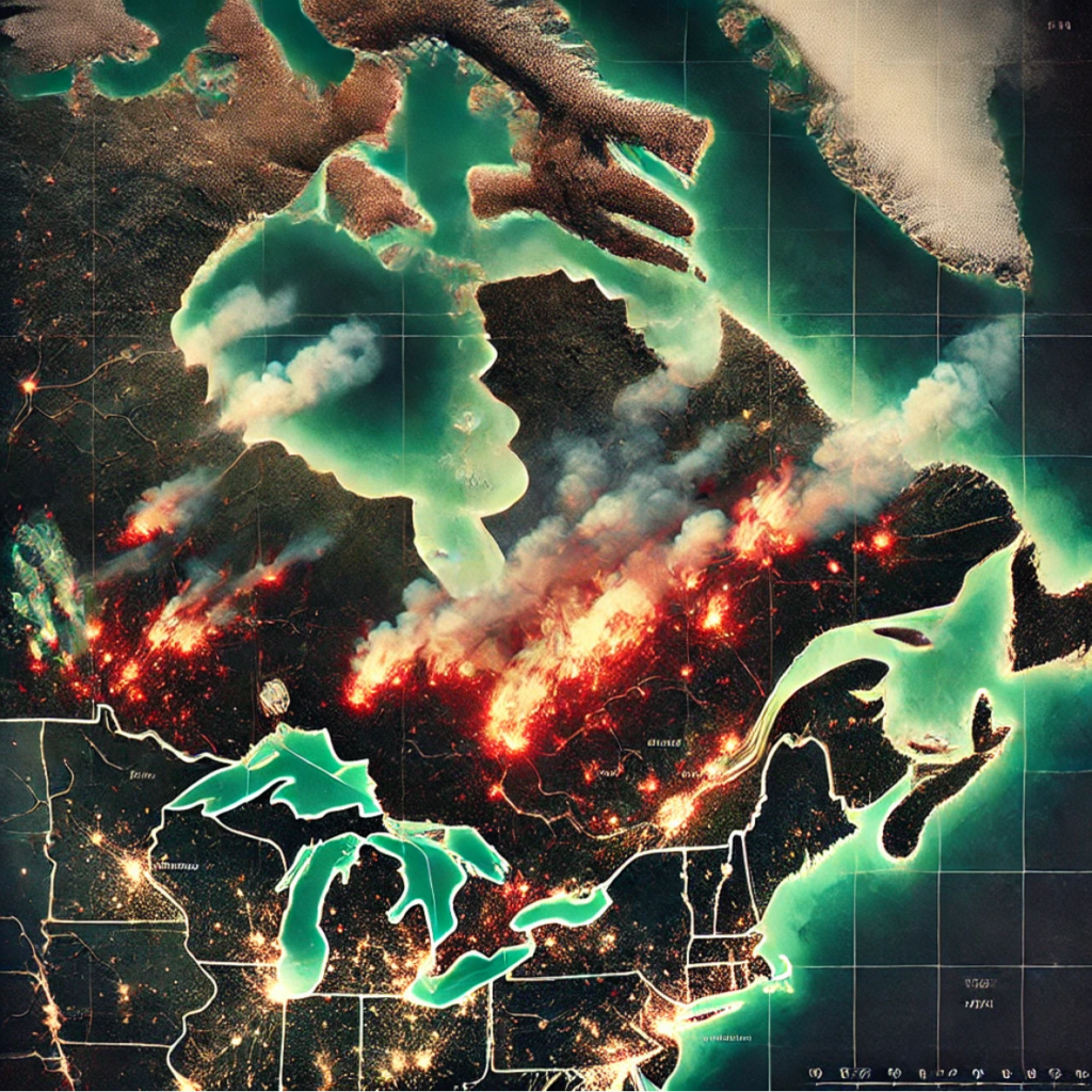
As I continue learning how to use Python with ArcGIS, I decided to revisit my previous Wildfires Project, with one goal in mind: quantify just how bad the 2023 wildfire season really was in Québec.
I was expecting to see a massive spike in burned area. After all, 2023 dominated headlines. Satellite imagery showed massive smoke plumes crossing borders, and there were evacuations across parts of the province. Surely the total area burned in Québec would dwarf previous years—right?
Well… not quite.
Why I Revisited the Project with Python
My original GIS maps were built using ArcGIS Pro, which allowed me to visualize fire perimeters and analyze environmental factors like drought and vegetation. But I wanted to take it further—use Python and GeoPandas to automate some analysis, dig into historical data, and generate comparisons that could go beyond just maps.
This blog post is the result of that exploration. And as it turns out, the data told a very different story from what I expected.
The Datasets
To do the comparison, I used two publicly available datasets:
- 2023 Fire Perimeter Data from the National Burned Area Composite (NBAC), downloaded from Natural Resources Canada
- 2020 Fire Perimeter Data from the National Fire Database (NFDB)
I filtered both datasets to include only fires in Québec, reprojected them to an equal-area coordinate system for accuracy (Canada Albers, EPSG:3347), and calculated the total burned area in square kilometers.
The Python Script
Here’s the basic workflow I used in Python:
import geopandas as gpd

# File paths
path_2023 = r"D:\Terra Curiosity\Project 2\GIS Data\nbac_2023_20240530\nbac_2023_20240530.shp"
path_2020 = r"D:\Terra Curiosity\Project 2\NFDB_poly_20210707.shp"

# Load shapefiles
fires_2023 = gpd.read_file(path_2023)
fires_2020 = gpd.read_file(path_2020)

# Filter 2020 to Quebec only
fires_2020_qc = fires_2020[fires_2020['SRC_AGENCY'] == 'QC']

# Reproject to equal-area CRS
fires_2023 = fires_2023.to_crs(epsg=3347)
fires_2020_qc = fires_2020_qc.to_crs(epsg=3347)

# Calculate area in square kilometers
fires_2023['area_km2'] = fires_2023.geometry.area / 1e6
fires_2020_qc['area_km2'] = fires_2020_qc.geometry.area / 1e6

# Summarize
total_2023 = fires_2023['area_km2'].sum()
total_2020 = fires_2020_qc['area_km2'].sum()

print(f" 2023: {total_2023:,.2f} km²")
print(f" 2020: {total_2020:,.2f} km²")
print(f" Increase: {total_2023 - total_2020:,.2f} km²")
print(f" Percent increase: {((total_2023 - total_2020) / total_2020 * 100):.1f}%")
The Results
Here’s what the data showed:
- Total burned area in Québec (2020): 139,147.50 km²
- Total burned area in Québec (2023): 140,078.94 km²
- Increase: 931.44 km²
- Percentage increase: 0.7%
Yep. Just 0.7% more area burned in 2023 compared to 2020.
So What Gives?
At first, I thought I had made a mistake. But as it turns out, there are many possible explanations:
1. Data limitations
It’s possible the 2023 dataset doesn’t include every fire that occurred—especially smaller ones, or fires from late in the season. Some areas may still be under review or haven’t been digitized.
2. 2020 was also a big fire year
This is something I hadn’t considered. If 2020 already had a high burn total, then 2023 feeling “worse” may have had more to do with smoke and visibility than raw area burned.
3. Smoke ≠ area burned
The massive smoke coverage in 2023 affected wide areas of North America, but that doesn’t always mean the total burned land was proportionally larger. In fact, some of the most dramatic smoke came from remote northern Québec.
4. Different mapping methods
The 2023 data may have been created using satellite-derived burn detection (e.g., MODIS or VIIRS), while older datasets like NFDB may use manually digitized fire perimeters or agency reports. That can lead to differences in precision and what gets included.
Takeaways
This experience was a good reminder of why it’s important to check your assumptions and let the data speak for itself. Python helped me quickly load and process these datasets, calculate burned areas, and discover something that wasn’t obvious just from watching the news or looking at satellite images.
Even though the increase wasn’t dramatic, this kind of analysis is still valuable—it shows that GIS and Python together can offer powerful, data-driven insight, even when the results surprise you.
