When I first explored the Cascadia Subduction Zone and its tsunami risk for coastal towns like Seaside, Oregon, my goal was to better understand how GIS could help inform disaster preparedness. The original project compared DOGAMI’s “XXL” tsunami inundation zone and highlighted infrastructure-based mitigation efforts in towns like Seaside and Westport, Washington.
But recently, I realized something was missing. While that map was informative, it wasn’t actionable. It showed the threat, but not necessarily the response.
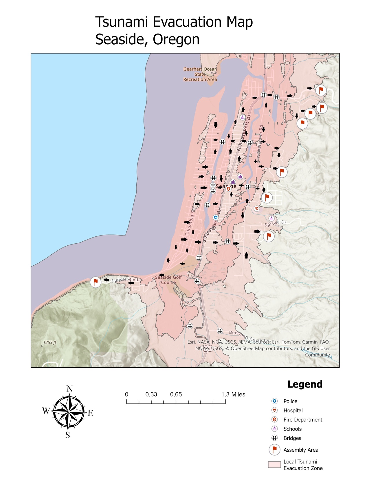
So I decided to take it a step further: to update the map not for academic readers or policy analysts, but for the people who might actually have to use it in a crisis.
Putting the Community First: A Customer-Obsessed Redesign
This redesign is grounded in a core design principle Amazon calls Customer Obsession—the idea that you start with the end user and work backward. For GIS, that means asking questions like:
- If I lived in Seaside, would I know where to go during a tsunami?
- Is the evacuation route easy to understand at a glance?
- Are assembly areas clearly marked and accessible to all residents?
With these questions in mind, I created a new version of the Seaside map that includes:
- The designated tsunami evacuation zones
- Tsunami assembly areas
- Clear arrows showing likely pedestrian evacuation routes
This map was built with clarity and speed in mind. In a real emergency, seconds matter—and confusion can be fatal.
Behind the Scenes: Tools, Limitations, and Lessons Learned
This new version wasn’t without challenges. While I used ArcGIS Pro for the core mapping layers, I encountered limitations with the available basemaps. Due to the ways in which ArcGIS layers data, the evacuation zones themselves had to be marked in a very high transparency (90-95%) to ensure the streets themselves would remain visible.
In addition, since ArcGIS is a GIS software, not a graphics design software, it has limited design applications for creating a polished end-user map. Lacking any real graphics design software of my own, I made the difficult decision to export the map I’d created in ArcGIS and manually add directional arrows in Paint, referring to official evacuation maps to determine the most ideal routes.
This isn’t ideal. A professional version of this map would use a more detailed basemap showing street names and other important information, as well as Adobe Illustrator or a similar graphics design software designed for visual hierarchy and user legibility.
But I still made the call to publish it—because getting something usable into the hands of a reader is better than waiting for perfection. This speaks to another leadership principle: Bias for Action.
From Hypothesis to Human Impact
In my original project, I hypothesized that GIS technology, combined with community-led planning, could substantially reduce the potential loss of life and property in the Pacific Northwest. This redesign moves closer to fulfilling that hypothesis—not just by analyzing the threat, but by visualizing a path to safety.
This process also taught me a valuable lesson: Insisting on the Highest Standards doesn’t mean avoiding imperfection—it means striving for usefulness, communicating clearly, and revisiting your work with the humility to say: I can do better.
But for now, I hope this new version of the Seaside tsunami map offers a small but meaningful example of what happens when GIS meets empathy—when we design not just with data, but with people in mind.