Lessons from Esri UC 2025
In one of the more insightful sessions from this year’s Esri User Conference, presenter Flora Vale emphasized a point that stuck with me: maps are powerful, but charts can make your message even clearer. Using an example of crime data by state, she showcased ways to visualize the data beyond just a simple map of states colored by crime count—and explained how to use charts such as bar charts or choropleth maps to help viewers better interpret key trends and magnitudes.
With her advice in mind, I went back to my 2023 Canadian Wildfires ArcGIS project and created three supplemental charts to shed more light on the raw data and to help communicate the keys lessons I learned from that project—particularly around timing, fire size distribution, and precipitation anomalies. Here’s what they show.
1. Ignition Timeline: Early June Spike
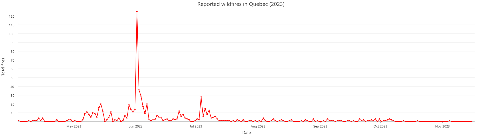
This line graph displays the number of reported wildfires by date. The most striking feature is the series of early spikes in May, leading into the massive early June spike which aligns closely with the worst air quality alerts issued across the U.S. Northeast. This was the moment when massive fire fronts converged, pushing thick smoke into cities like New York, Philadelphia, and Washington D.C.
The timing reinforces the idea that even small fires earlier in the season can serve as precursors or accelerants to large-scale events.
2. Fire Size Distribution: Many Small, Few Catastrophic
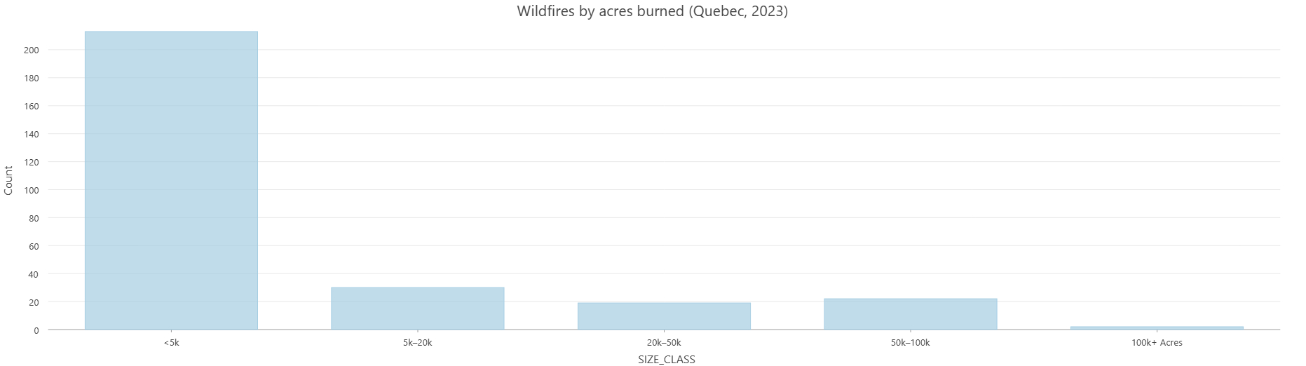
This bar chart plots the number of fires by acreage burned, grouped into size categories. The takeaway: most fires were under 5,000 acres, with only a handful burning over 100,000 acres.
While this might seem surprising given the massive media attention, it reflects an important reality—headline fires are the exception, not the norm. While hundreds of wildfires may burn in the same geographic location within a single fire season, the vast majority are small, localized, and quickly contained. But the few wildfires that do spiral out of control can reduce many square miles of forest to ash, blanket large parts of the globe with smoke, and grab the attention of the media for weeks.
This chart is a reminder of the disproportionate impact of extreme outliers.
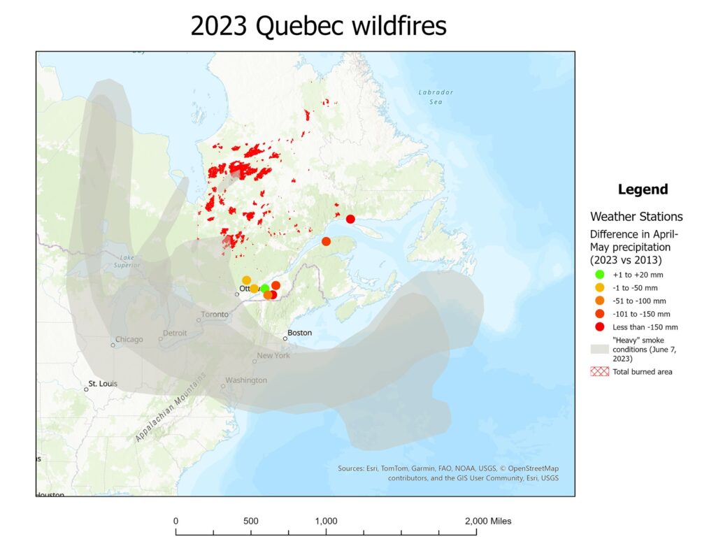
3. Precipitation Deficit: Drought as a Driver
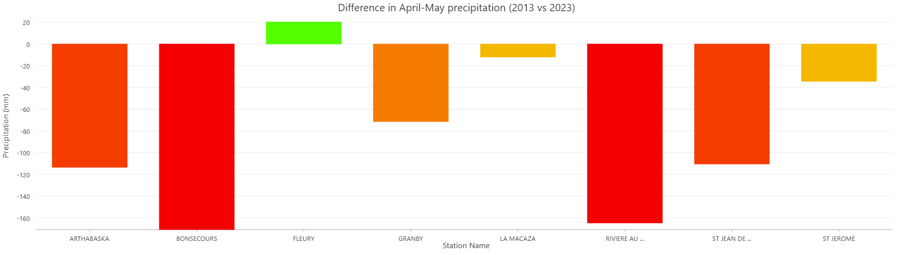
This final bar chart compares April–May precipitation in 2023 vs. 2013 at the eight weather stations across Quebec that I chose to obtain data from in my project. Only one station (Fleury) reported an increase; the other seven all showed a notable drop, with two of the stations even showing over 150 mm less rainfall compared to a decade prior.
This lack of spring rain dried out vegetation and created the perfect fuel bed for widespread ignition, especially when paired with higher-than-average temperatures and human activity near ignition points.
Why These Charts Matter
These supplemental charts don’t replace the original map—they complement it by surfacing patterns that might otherwise go unnoticed. Whether it’s the sudden ignition spike, the fire size disparity, or the precipitation drop, each one adds a layer of nuance that helps tell the broader story of the 2023 wildfire season.
Thanks again to Flora Vale and the 2025 Esri UC presenters for encouraging me to take my analysis one step further.